YMCA of Greater Seattle
Reminding people the YMCA is more than a catchy song

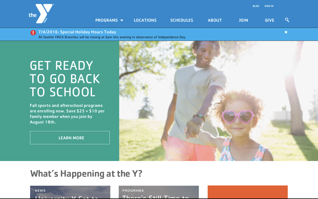
The problem
The YMCA of Greater Seattle hadn’t updated their web presence in several years. They had a difficult to use CMS that resulted in dozens of micro-sites that confused and overwhelmed new visitors and existing members. Additionally, the organization does so much for so many people, users were unable to find actionable information about what they were looking for.
In addition, the Seattle YMCA wanted their design to be a part of the Open Y initiative; a collection of open source technologies used to power the website. This would require an extensible design system that could grow to meet the future needs of several YMCAs, and not just Seattle.
My solution
As the lead UX researcher and designer for the project, I interviewed several stakeholders, toured YMCA branches and spoke with existing members to get an understanding of how the site is used, and what the site should be. I restructured the site to allow for progressive disclosure to help users avoid feeling overwhelmed and to make navigation between sections easier. I proposed a fully responsive design that adhered to industry best practices. I also worked closely with visual designers to create a design language, and not just a stand-alone collection of templates.
My Contribution
Stakeholder interviews
Baseline usability study
Client workshop
User stories
Information architecture
Site map
Wireframes
Interactive prototype
Usability testing
Art direction
Stakeholder Interviews
“Our best strength and greatest weakness is that we do so many different things. How can the platform support all the people we want to reach and maintain coherence?”
Baseline Usability Study
Lorem ipsum sit aler dolor.
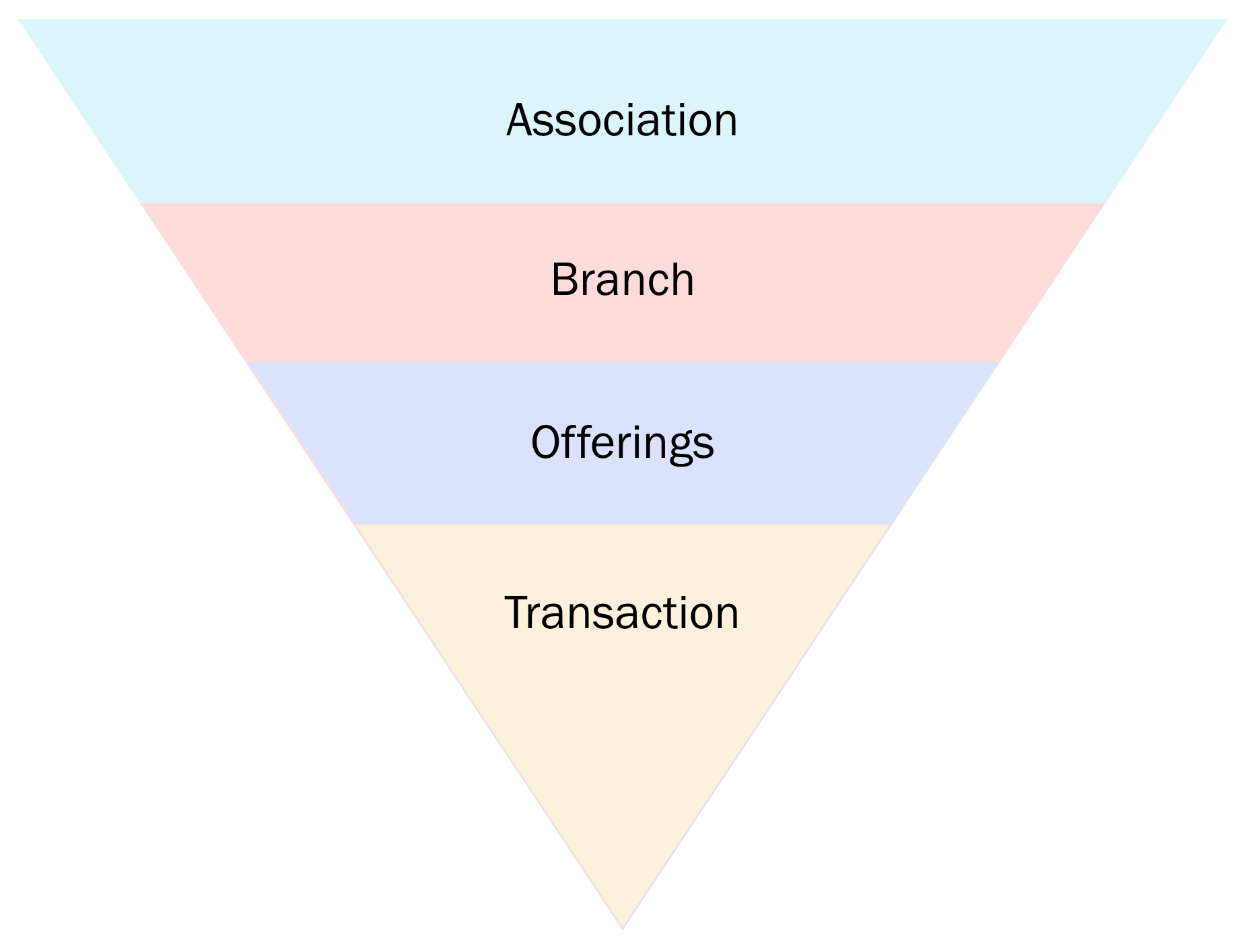
Information Architecture
Finding the balance between story and action
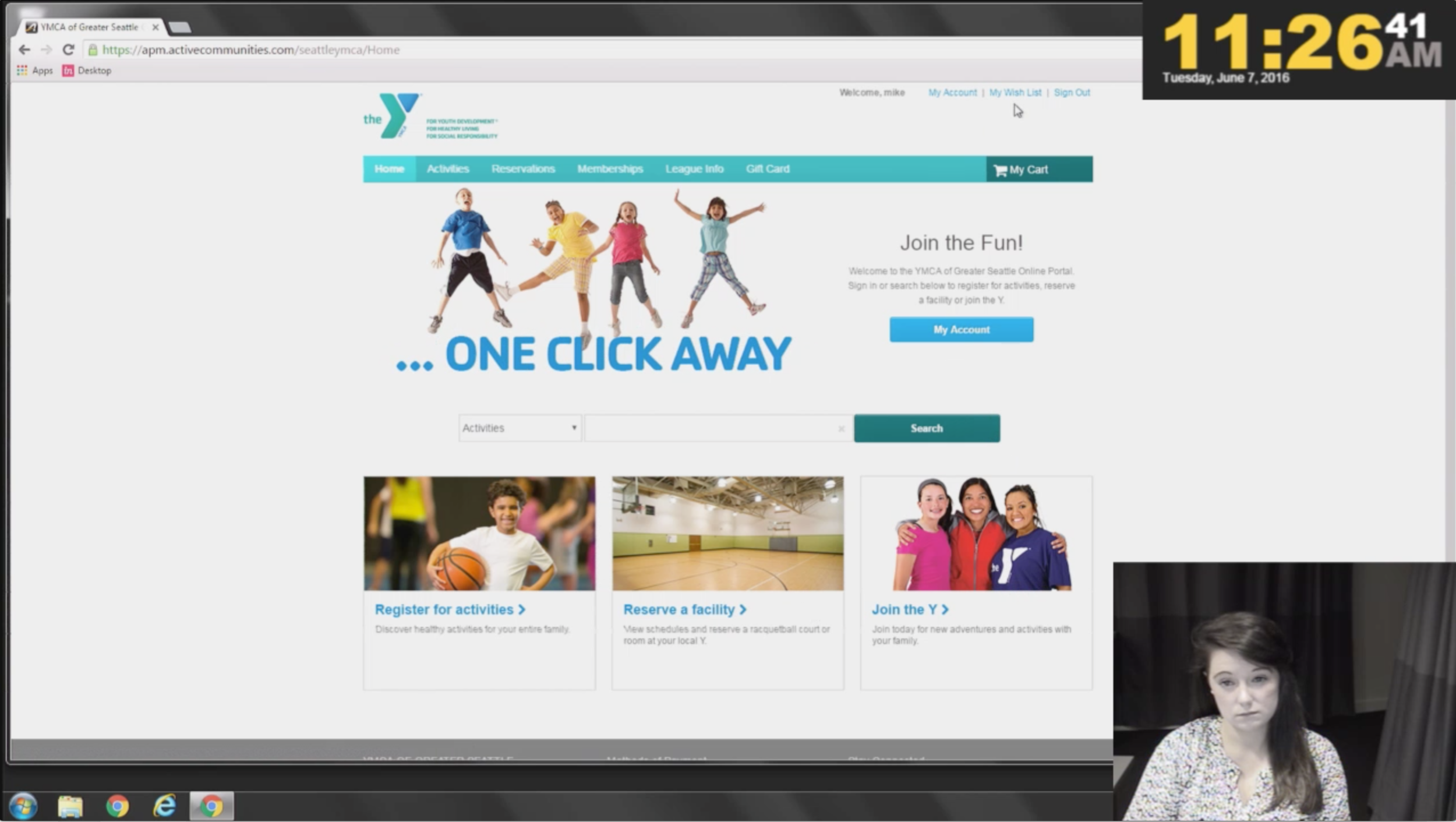
Users of the YMCA website are very action-oriented. But in order to convince them to complete the most valuable actions to the YMCA (donating, becoming a member), they needed to feel connected to the organization. Also, because users needed to complete transactions on a difficult to use, third-party website, I needed to ensure as much as possible they were set up for success.
Wireframes
Visual Design
Style guide
Results
More members of the family
After the launch of the redesign, the YMCA saw a 40% increase in online memberships.
More revenue
In addition, they also a 20% increase in online class and activity purchases.