
Northwest Kidney Center
A helping hand when needed most
The problem
Northwest Kidney Centers is the largest, non-profit dialysis provider in the country. Patients come to their website seeking guidance and help. With the old website, however, it was difficult for patients to find what they needed. Features were almost hidden, navigation was difficult, and memorials to patients who had passed away often appeared on the home page, depressing and scaring new visitors.
My solution
My team and I completely overhauled the site’s navigation to make it easier for users to get where they needed to go. We surfaced valuable features of the site that existing patients did not even know were available. And since nutrition and diet are so important to kidney disease patients, I took particular care in redesigning the website’s recipe finder.
And since vision impairment and colorblindness are both very common in kidney disease patients, so all design work was rigorously tested for accessibility.
My Contribution
Personas (3)
Baseline usability testing
Sketches
User stories
Information architecture
Site map
Wireframes
Interactive prototype
Usability testing
Art direction
Personas
Personas are a great way of building empathy with users, which was crucial for this project. They can also help define design goals and success criteria. We created three personas and, working closely with our client, prioritized them so we could better understand where the focus of the site should be.
Who we built the site for
Tim is an in-center dialysis patient. He is our oldest persona and has had kidney disease the longest. He’s looking to simply maintain his current care.
Alison is an in-home dialysis patient. She manages her own care and is actively looking for a kidney donor.
Sebastian represented patients newly diagnosed with kidney disease. They needed reassurance that they could continue living a normal, happy life.
Sketches
Early sketches for what would become the Northwest Kidney Centers’ home page.
Highlighting recipes and events on the home page.
Exploring ways of guiding patients to the best experience for their needs.
Wireframes
Usability Testing
The redesign received lots of positive feedback. The study also revealed areas where the design could be improved. I applied those findings as the team moved forward with the visual design.
Post Usability Questionnaire
In addition to conducting a usability test of a prototype of the new design, we also conducted a baseline test of the existing website. We were later able to compare the results of the designs using a post-session questionnaire.
The results for the new design are in red, while the old site is in blue. It is clear that the changes we made to the design had a tangible and positive impact on patients’ experience.
Visual Design
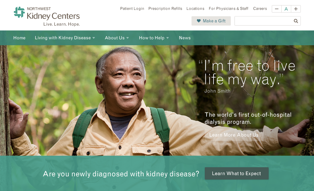
We had several goals for the visual design. First, we wanted to ensure the site fit in with Northwest Kidney Centers’ existing brand guidelines. Second, we wanted to highlight on the site people of color who are disproportionately affected by kidney disease. Representation is important, especially in stressful situations, to build the feeling of “I am not alone.” Lastly, the site needed to feel friendly and approachable. We were able to achieve this through balancing color, photography, and a simple, non-serif typeface that felt informative without talking down to patients.
Results
This was one of the more satisfying projects I’ve ever had the pleasure of working on. My design work had a direct impact on people’s lives, a responsibility I did not take lightly. As a direct result of my work, patients were able to discover, and begin using, the Northwest Kidney Centers’ pharmacy home delivery, a service most patients we spoke with didn’t know existed. Access of recipes and attendance of events also increased significantly.
The site is live, and can be viewed at https://www.nwkidney.org.