KCTS 9
Introducing a trusted name to a new audience

The problem
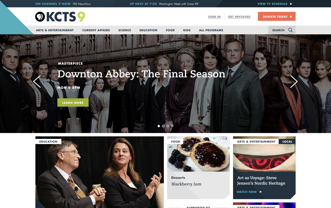
KCTS 9, along with all of public media, and broadcast in general, have been losing marketshare to internet streaming services like Netflix and Hulu for years. They needed to find a way to revitalize their web presence, showcase tent-pole programming such as Downton Abbey, highlight their breadth of content beyond just video, and broaden their audience to include a younger generation of viewers and potential donors.
My solution
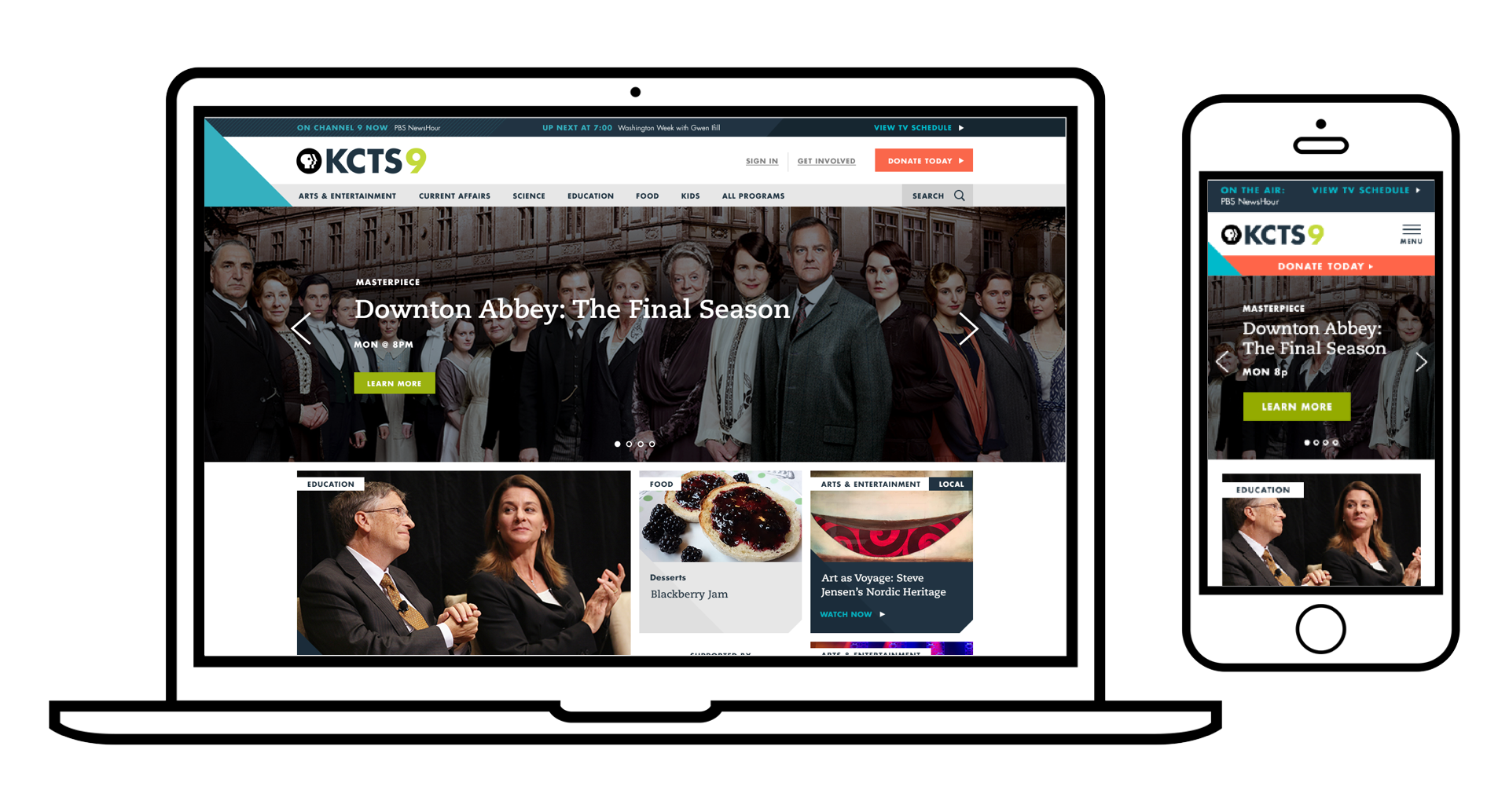
While working as part of a team with Fell Swoop, I proposed a dynamic and responsive redesign that would feel fresh and new upon each visit. I restructured the navigation to help users more easily find the content they were looking for, while at the same time giving them ways to discover brand new content the would also enjoy.
I also introduced a completely redesigned tv schedule that would not only be informative and easy to use, but engaging and mobile-friendly.
My Contribution
Sketches
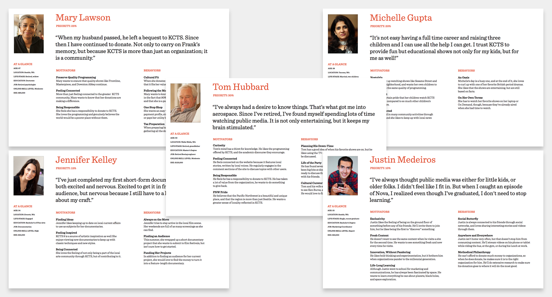
Personas (5)
User stories
Information architecture
Site map
Wireframes
Interactive prototype
Usability testing
Art direction
Personas
Sketches
Sketches are a great way to get buy-in from a client early on in a project. They’re fantastic to help gauge reactions to features themes. They also allow you to take creative risks, since they are so quick and easy to produce.
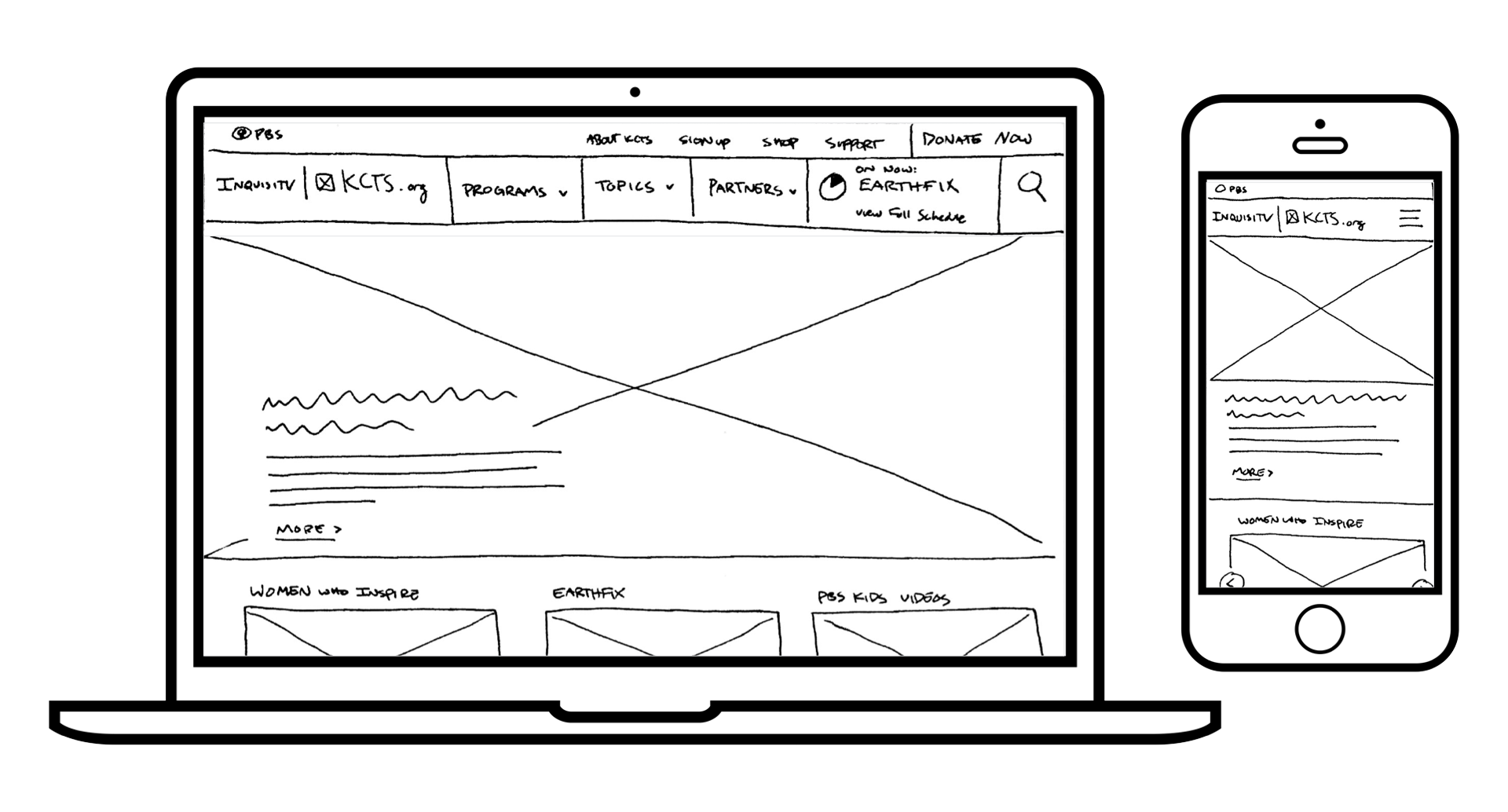
Early sketches for what would become the KCTS 9 home page.
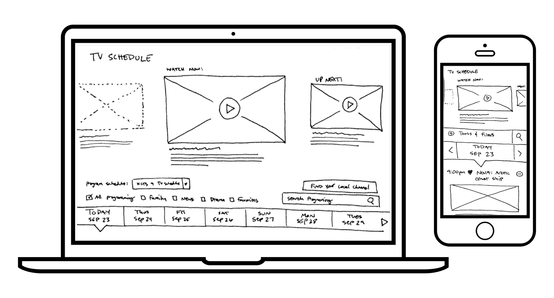
Preliminary sketches for the responsive tv schedule.
Information Architecture
Every Page in its Place.
In restructuring the navigation, I discovered that there was a natural hierarchy to the content - Topics, such as Science or Arts & Culture were at the top, followed by Programs (like Nova or Downton Abbey), and lastly Content Pages. Content Pages could either be a specific episode of a program, an article written by a staff reporter, a podcast, or any other individual piece of media.
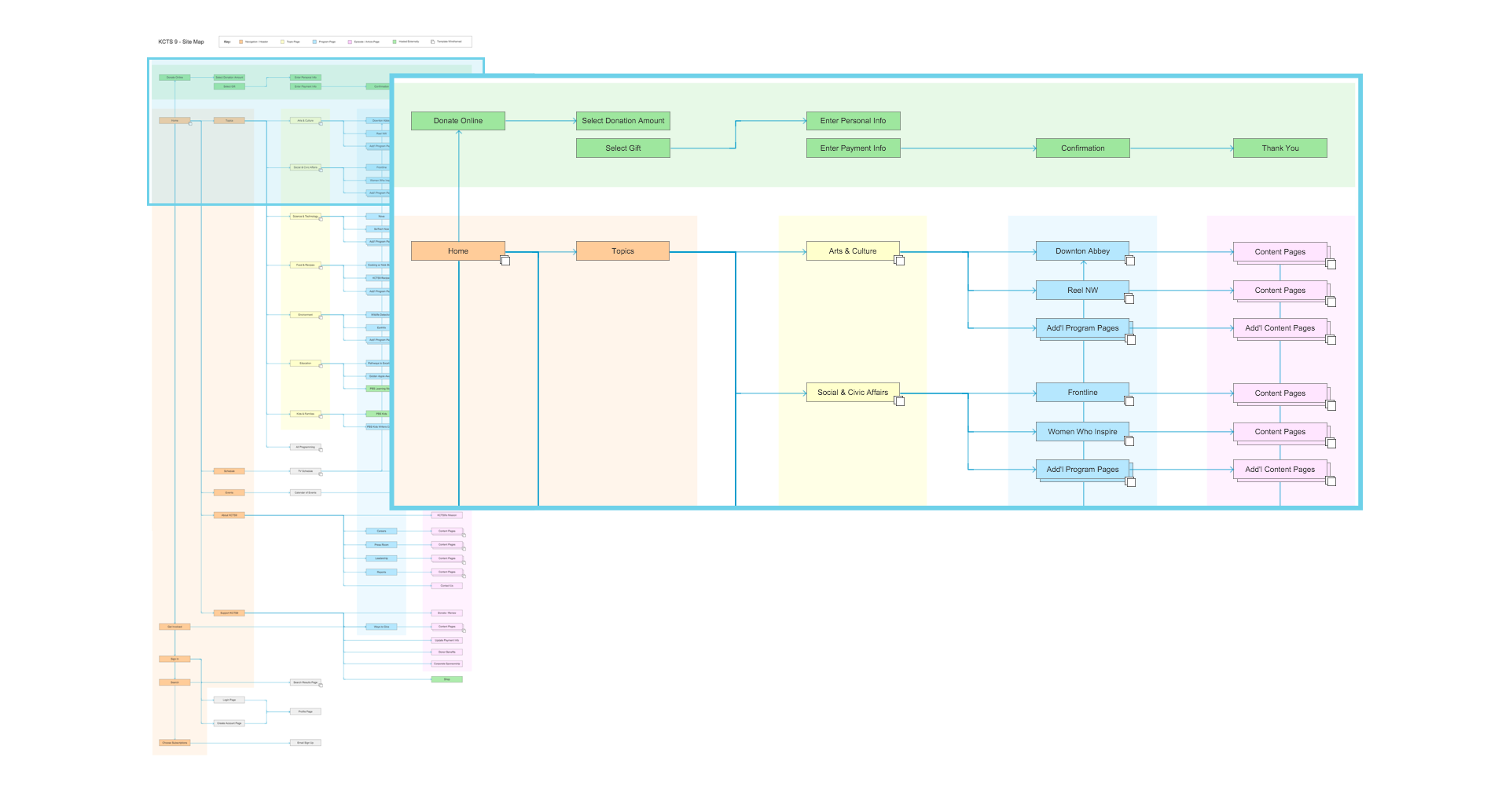
Wireframes
Visual Design
Results
When we tested the new design with users in our UX Lab, we found it vastly outperformed the old site. Users were able to easily and more accurately navigate around, and were more successful in searching. Participants across demographics loved the visual updates, and found content easy to consume. Additionally, as easy as it was for participants to use the desktop version, they found the mobile site even easier to use.
As of the posting of this page, the design is still live at kcts9.org, and you can visit it for yourself.